
Please select a foreground color and a background color. You can enter hex color codes or use the color selector tool (aka eye dropper in the color input element). The “WCAG Compliance Information” chart will tell you if the selected colors pass conformance.
1
Demo Text
Beautiful light is born of a contrast to darkness.
| Element Type | WCAG AA | WCAG AAA |
|---|---|---|
| Small Text | ✔ Pass | ✖ Fail |
| Large Text | ✔ Pass | ✖ Fail |
| UI Components | ✔ Pass | ✖ Fail |

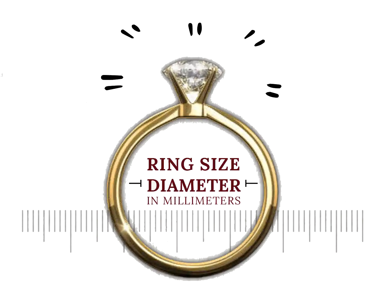
Curious about your ring size? Check out this amazing tool to know your ring size accurately
Check now
Wappsy - Message people without saving their phone number seamlessly!
Check nowThe Web Content Accessibility Guidelines (WCAG) define the different levels of contrast rations depending on the level of success criteria. Below is helpful information for comparing the results of our tool to the level of success criteria you hope to achieve.
Feeling inquisitive? Have a read
through some of our FAQs
or
contact our supporters for help
Color contrast is the difference in light between a font (or any other element) in the foreground and its background. With respect to web accessibility, the right color contrast can determine whether users with visual disabilities will be able to read your content or not. For example, a yellow font on a white background is less perceivable to a user with low contrast vision than a white font on a black background. Choosing the wrong color combinations can make navigating and interacting with your site confusing or even impossible. Your website’s chosen color scheme should be accessible to people with color blindness, low vision, low contrast sensitivity, or other visual disabilities, who may not be able to adequately perceive certain color combinations. While having sufficient color contrast is necessary for accessibility reasons, it also makes content easier to see and read for everyone, resulting in a better user experience for all visitors.
The Colorify''s Color Contrast Checker is an easy-to-use tool that helps you determine whether your website’s chosen font and background colors are accessible to people with low vision and color deficiencies. The Web Content Accessibility Guidelines (WCAG) uses a figure known as the color contrast ratio to determine whether your chosen font and background colors meet the level of contrast that is considered acceptable. Since every color on the web is assigned a unique identifier (for example RGB values or HEX codes), it is possible to accurately analyze and compare two color codes against each other, thereby calculating the contrast ratio. The ratio is composed of two numbers, where a 1:1 ratio is the weakest contrast (for example a white font on a white background), and a 21:1 ratio is the strongest contrast (for example, black font on a white background). To check whether your font and background colors meet WCAG’s minimum requirements for accessibility, all you need to do is input the HEX values for your chosen colors into the Siteimprove Color Contrast Checker. The tool then automatically calculates and presents your color contrast ratio.
WCAG 2.1 requires a contrast ratio of at least 3:1 for certain graphic elements and user interface components, such as form input borders. However, decorative images, brand logos, and media files are not included in the WCAG color contrast requirements, though it is still in your best interests to comply with them.
Yes, our color contrast checker is absolutely free tool to use without spending a single penny.
Hey there! ☕️✨ Your support means the world to us! If you enjoyed using our tool what and could spare the cost of a cup of coffee, it would make a huge difference. Your generosity helps us keep the creativity flowing and the coffee brewing. Any amount, big or small, is greatly appreciated!🌟
Do not miss the latest information from us about the trending in the market. By clicking the button, you are agreeing with our Term & Conditions
🌟 Dear amazing users,
Support our talented developers by donating the cost of a cup of coffee by clicking here
Explore our other innovative products – you might find your next favorite!
🌐 Spread the word! Share our story with friends and help our young startup thrive.
💙 Your support means the world to us. Thank you for being part of our journey!