
Add a shortcut to the Home Screen
| Color Model | Value |
|---|---|
| RGB | 0, 0, 0 |
| HEX | #000000 |
| HSL | 0, 0%, 0% |
| HSV | 0, 0%, 0% |
| CMYK | 0, 0, 0, 0 |

Explore the Spectrum, where every shade tells a story of endless possibilities.
Shades are created by adding black to a color, making it darker and giving it a more intense or mysterious appearance. It's like turning up the dimmer switch on a color.
Tints result from adding white to a color, making it lighter and softer. This process brightens the color and gives it a more delicate or pastel-like quality, similar to adding a splash of sunlight to it.

Warm colors include red, orange, and yellow. They are associated with energy, passion, and enthusiasm. These colors create a sense of warmth and can be used to create focal points or draw attention to specific elements in a design.

On the contrary, cool colors such as blue, green, and purple are known for their calming effect. They are often used to create a sense of tranquility and serenity in a design. These colors work well for backgrounds or elements that need to evoke a sense of peacefulness.

Neutral colors include white, black, gray, and brown. They are often used as a base palette or to balance out more vibrant colors. Neutral colors can add a timeless and sophisticated touch to any design.
Color harmonies refer to combinations that involve variations of the same hue or different tones while maintaining a specific relationship with the chosen colors.
Analogous colors are those found next to each other on the color wheel. These colors, along with the chosen one, create natural and harmonious combinations that work well together.
Monochromatic colors share the same base hue but differ in terms of shade, brightness, and saturation. Utilizing two or more monochromatic colors can produce an elegant and pleasing visual effect.
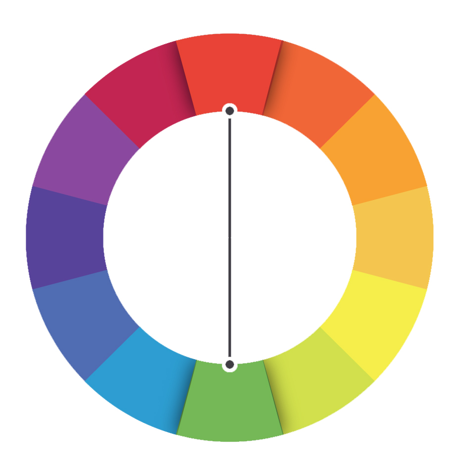
Complementary colors are opposites on the color wheel. They neutralize each other when combined and are useful for achieving color balance. It's important to use them in equal amounts to avoid color dominance.
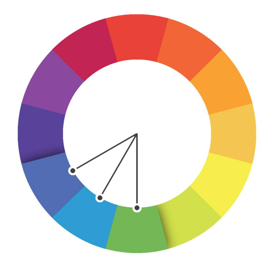
Instead of choosing direct opposites, split complementaries involve selecting the two adjacent colors to the chosen one. This approach leaves a predominant tone and avoids complete neutralization.
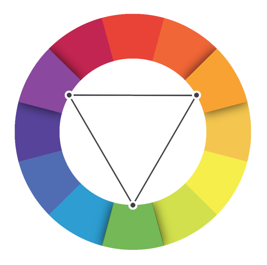
Triads involve combining three colors with 120º angles on the color wheel. These stable and complementary color harmonies, such as yellow, red, and blue, create visually pleasing combinations.
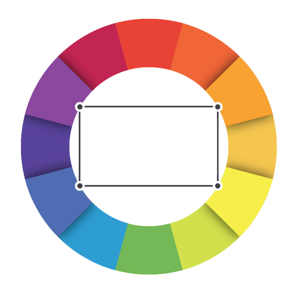
Tetrads are combinations of four colors that do not involve using two complementary pairs. Working with tetrads can be more complex, especially when dealing with color correction. Some tetrads may also include six colors, incorporating chromatic contrasts for added depth.
Hey there! ☕️✨ Your support means the world to us! If you enjoyed using our tool what and could spare the cost of a cup of coffee, it would make a huge difference. Your generosity helps us keep the creativity flowing and the coffee brewing. Any amount, big or small, is greatly appreciated!🌟